The 2024 Solar Eclipse: What’s All the Fuss About?

April 17th, 2024

I feel fortunate to have witnessed two total solar eclipses in my lifetime. The first was at Center Hill Lake in central Tennessee in 2017, then this year’s (April 8) eclipse from Paducah, Kentucky. Given my age (68), I doubt I will see another.

For those who have not witnessed one, many look at the resulting photos and say, “So what?”. When I look at most of the photos (including the ones I’ve taken) I can tell you that those photos do not fully reflect the visual experience. More on that in a minute.

Having daytime transition into night in a matter of seconds is one part of the experience, with the sounds of nature swiftly changing as birds and frogs suddenly realize, “Night sure came quickly today!”

It’s also cool to hear people around you respond to what they are witnessing. The air temperature becomes noticeably cooler. Scattered low clouds that might have threatened to get in the way mostly disappear, just as they do after sunset.

But why are so many photos of the event… well… underwhelming? After thinking about this over the past week, I believe the answer lies in the extreme range of brightness a solar eclipse produces that cameras (even good ones) have difficulty capturing. This is why individual photos you see will often look different from one another. Depending upon camera exposure settings, you will see different features.

This was made very apparent to me during this year’s eclipse. Due to terrible eclipse traffic, we had to stop short of our intended destination, and I had only 10 minutes to set up a telescope and two cameras, so some of my advance planning went out the window. I was watching the “diamond” of the diamond ring phase of totality, as the last little bit of direct sunlight disappears behind the moon. At that point, it is (in my opinion) possible with the naked eye to perceive a dynamic range greater than any other scene in nature: from direct sunlight of the tiny “diamond” to the adjacent night sky with stars. I took the following photo with a Canon 6D MkII camera with 560 mm of stacked Canon lenses, which (barely) shows this extreme range of brightness.

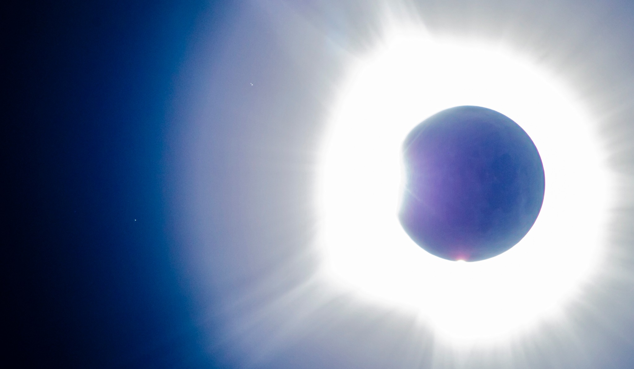
In order to pull out the faint Earthshine on the moon’s dark side in this photo, and the stars to the left and upper-left, I had to stretch this exposure by quite a lot.

From what I have read (and experienced) the human eye/brain combination can perceive a greater dynamic range of brightness than a camera can. This is why photographers have to fool so much with camera settings to capture what their eyes see. In this case, I perceived the “diamond” of direct sunlight was (of course) blindingly bright, while the sun’s corona extending 2 to 3 solar diameters away from the sun was much less bright (in fact, the solar corona is not even as bright as a full moon). But in this single photo, both the diamond and the corona were basically at the maximum brightness the camera could capture at this exposure setting (0.5 sec, ISO400, f/5.6), even though visually they had very different brightnesses.

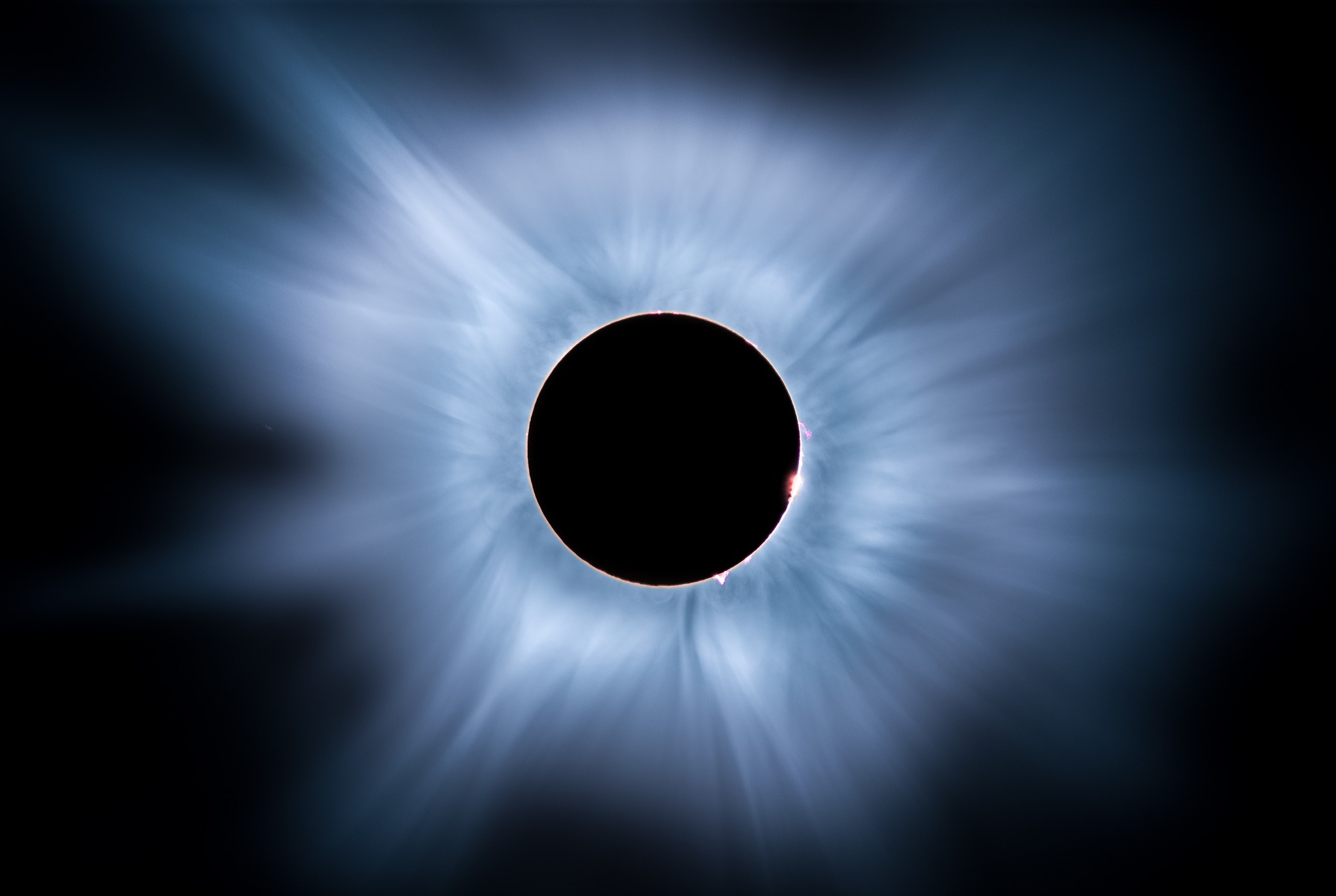
Many of the better photos you will find are composites of multiple photos taken over a very wide range of camera settings, which more closely approximate what the eye sees. I found this one that seems closer to what I witnessed (photo by Mark Goodman):

So, if you have never experienced a total solar eclipse, and are underwhelmed by the photos you see, I submit that the actual experience is much more dramatic than the photos indicate.

Here’s some unedited real-time video I took with my Sony A7SII camera mounted on a Skywatcher Esprit ED80 refractor telescope. We were in a Pilot Travel Center parking lot with about a dozen other cars that also didn’t make it o their destinations due to the traffic. I used a solar filter until just before totality, then removed the filter. The camera is on an automatic exposure setting. I’ve done no color grading of the video. Skip ahead to the 3 minute mark to catch the transition to totality:

UAH Global Temperature Update for March, 2024: +0.95 deg. C

April 2nd, 2024

The Version 6 global average lower tropospheric temperature (LT) anomaly for March, 2024 was +0.95 deg. C departure from the 1991-2020 mean, up slightly from the February, 2024 anomaly of +0.93 deg. C, and setting a new high monthly anomaly record for the 1979-2024 satellite period.

New high temperature records were also set for the Southern Hemisphere (+0.88 deg. C, exceeding +0.86 deg. C in September, 2023) and the tropics (+1.34 deg. C, exceeding +1.27 deg. C in January, 2024). We are likely seeing the last of the El Nino excess warmth of the upper tropical ocean being transferred to the troposphere.

The linear warming trend since January, 1979 remains at +0.15 C/decade (+0.13 C/decade over the global-averaged oceans, and +0.20 C/decade over global-averaged land).

The following table lists various regional LT departures from the 30-year (1991-2020) average for the last 14 months (record highs are in red):

YEARMOGLOBENHEM.SHEM.TROPICUSA48ARCTICAUST
2023Jan-0.04+0.05-0.13-0.38+0.12-0.12-0.50
2023Feb+0.09+0.17+0.00-0.10+0.68-0.24-0.11
2023Mar+0.20+0.24+0.17-0.13-1.43+0.17+0.40
2023Apr+0.18+0.11+0.26-0.03-0.37+0.53+0.21
2023May+0.37+0.30+0.44+0.40+0.57+0.66-0.09
2023June+0.38+0.47+0.29+0.55-0.35+0.45+0.07
2023July+0.64+0.73+0.56+0.88+0.53+0.91+1.44
2023Aug+0.70+0.88+0.51+0.86+0.94+1.54+1.25
2023Sep+0.90+0.94+0.86+0.93+0.40+1.13+1.17
2023Oct+0.93+1.02+0.83+1.00+0.99+0.92+0.63
2023Nov+0.91+1.01+0.82+1.03+0.65+1.16+0.42
2023Dec+0.83+0.93+0.73+1.08+1.26+0.26+0.85
2024Jan+0.86+1.06+0.66+1.27-0.05+0.40+1.18
2024Feb+0.93+1.03+0.83+1.24+1.36+0.88+1.07
2024Mar+0.95+1.02+0.88+1.34+0.23+1.10+1.29

The full UAH Global Temperature Report, along with the LT global gridpoint anomaly image for March, 2024, and a more detailed analysis by John Christy, should be available within the next several days here.

The monthly anomalies for various regions for the four deep layers we monitor from satellites will be available in the next several days:

Lower Troposphere:

http://vortex.nsstc.uah.edu/data/msu/v6.0/tlt/uahncdc_lt_6.0.txt

Mid-Troposphere:

http://vortex.nsstc.uah.edu/data/msu/v6.0/tmt/uahncdc_mt_6.0.txt

Tropopause:

http://vortex.nsstc.uah.edu/data/msu/v6.0/ttp/uahncdc_tp_6.0.txt

Lower Stratosphere:

http://vortex.nsstc.uah.edu/data/msu/v6.0/tls/uahncdc_ls_6.0.txt

UAH Global Temperature Update for February, 2024: +0.93 deg. C

March 2nd, 2024

The Version 6 global average lower tropospheric temperature (LT) anomaly for February, 2024 was +0.93 deg. C departure from the 1991-2020 mean, up from the January, 2024 anomaly of +0.86 deg. C, and equaling the record high monthly anomaly of +0.93 deg. C set in October, 2023.

The linear warming trend since January, 1979 remains at +0.15 C/decade (+0.13 C/decade over the global-averaged oceans, and +0.20 C/decade over global-averaged land).

A new monthly record high temperature was set in February for the global-average ocean, +0.91 deg. C.

The following table lists various regional LT departures from the 30-year (1991-2020) average for the last 14 months (record highs are in red):

YEARMOGLOBENHEM.SHEM.TROPICUSA48ARCTICAUST
2023Jan-0.04+0.05-0.13-0.38+0.12-0.12-0.50
2023Feb+0.09+0.17+0.00-0.10+0.68-0.24-0.11
2023Mar+0.20+0.24+0.17-0.13-1.43+0.17+0.40
2023Apr+0.18+0.11+0.26-0.03-0.37+0.53+0.21
2023May+0.37+0.30+0.44+0.40+0.57+0.66-0.09
2023June+0.38+0.47+0.29+0.55-0.35+0.45+0.07
2023July+0.64+0.73+0.56+0.88+0.53+0.91+1.44
2023Aug+0.70+0.88+0.51+0.86+0.94+1.54+1.25
2023Sep+0.90+0.94+0.86+0.93+0.40+1.13+1.17
2023Oct+0.93+1.02+0.83+1.00+0.99+0.92+0.63
2023Nov+0.91+1.01+0.82+1.03+0.65+1.16+0.42
2023Dec+0.83+0.93+0.73+1.08+1.26+0.26+0.85
2024Jan+0.86+1.06+0.66+1.27-0.05+0.40+1.18
2024Feb+0.93+1.03+0.83+1.24+1.36+0.88+1.07

The full UAH Global Temperature Report, along with the LT global gridpoint anomaly image for February, 2024, and a more detailed analysis by John Christy, should be available within the next several days here.

The monthly anomalies for various regions for the four deep layers we monitor from satellites will be available in the next several days:

Lower Troposphere:

http://vortex.nsstc.uah.edu/data/msu/v6.0/tlt/uahncdc_lt_6.0.txt

Mid-Troposphere:

http://vortex.nsstc.uah.edu/data/msu/v6.0/tmt/uahncdc_mt_6.0.txt

Tropopause:

http://vortex.nsstc.uah.edu/data/msu/v6.0/ttp/uahncdc_tp_6.0.txt

Lower Stratosphere:

/vortex.nsstc.uah.edu/data/msu/v6.0/tls/uahncdc_ls_6.0.txt

UAH Global Temperature Update for February, 2024: Delayed

February 27th, 2024

Due to a recent hardware failure affecting most UAH users of our dedicated “Matrix” computer system, the disk drives are having to be repopulated from backups. This is now in progress, but I am told it will take from “days to weeks”. Complicating the delay is the fact we cannot do our daily downloads of satellite data files from NOAA, and it will take time to catch up with special data orders. I will post updates here as I have more information.

Proof that the Spencer & Christy Method of Plotting Temperature Time Series is Best

February 9th, 2024

Since the blogosphere continues to amplify Gavin Schmidt’s claim that the way John Christy and I plot temperature time series data is some form of “trickery”, I have come up with a way to demonstrate its superiority. Following a suggestion by Heritage Foundation chief statistician Kevin Dayaratna, I will do this using only climate model data, and not comparing the models to observations. That way, no one can claim I am displaying the data in such a way to make the models “look bad”.

The goal here is to plot multiple temperature time series on a single graph in such a way the their different rates of long-term warming (usually measured by linear warming trends) are best reflected by their placement on the graph, without hiding those differences.

A. Raw Temperatures

Let’s start with 32 CMIP6 climate model projections of global annual average surface air temperature for the period 1979 through 2100 (Plot A) and for which we have equilibrium climate sensitivity (ECS) estimates (I’ve omitted 2 of the 3 Canadian model simulations, which produce the most warming and are virtually the same).

Here, I am using the raw temperatures out of the models (not anomalies). As can be seen in Plot A, there are rather large biases between models which tend to obscure which models warm the most and which warm the least.

B. Temperature Anomalies Relative to the Full Period (1979-2100)

Next, if we plot the departures of each model’s temperature from the full-period (1979-2100) average, we see in Plot B that the discrepancies between models warming rates are divided between the first and second half of the record, with the warmest models by 2100 having the coolest temperature anomalies in 1979, and the coolest models in 2100 having the warmest temperatures in 1979. Clearly, this isn’t much of an improvement, especially if one wants to compare the models early in the record… right?

C. Temperature Anomalies Relative to the First 30 Years

The first level of real improvement we get is by plotting the temperatures relative to the average of the first part of the record, in this case I will use 1979-2008 (Plot C). This appears to be the method favored by Gavin Schmidt, and just looking at the graph might lead one to believe this is sufficient. (As we shall see, though, there is a way to quantify how well these plots convey information about the various models’ rates of warming.)

D. Temperature Departures from 1979

For purposes of demonstration (and since someone will ask anyway), let’s look at the graph when the model data are plotted as departures from the 1st year, 1979 (Plot D). This also looks pretty good, but if you think about it the trouble one could run into is that in one model there might be a warm El Nino going on in 1979, while in another model a cool La Nina might be occurring. Using just the first year (1979) as a “baseline” will then produce small model-dependent biases in all post-1979 years seen in Plot D. Nevertheless, Plots C and D “look” pretty good, right? Well, as I will soon show, there is a way to “score” them.

E. Temperature Departures from Linear Trends (relative to the trend Y-intercepts in 1979)

Finally, I show the method John Christy and I have been using for quite a few years now, which is to align the time series such that their linear trends all intersect in the first year, here 1979 (Plot E). I’ve previously discussed why this ‘seems’ the most logical method, but clearly not everyone is convinced.

Admittedly, Plots C, D, and E all look quite similar… so how to know which (if any) is best?

How the Models’ Temperature Metrics Compare to their Equilibrium Climate Sensitivities

What we want is a method of graphing where the model differences in long-term warming rates show up as early as possible in the record. For example, imagine you are looking at a specific year, say 1990… we want a way to display the model temperature differences in that year that have some relationship to the models’ long-term rates of warming.

Of course, each model already has a metric of how much warming it produces, through their diagnosed equilibrium (or effective) climate sensitivities, ECS. So, all we have to do is, in each separate year, correlate the model temperature metrics in Plots A, B, C, D, and E with the models’ ECS values (see plot, below).

When we do this ‘scoring’ we find that our method of plotting the data clearly has the highest correlations between temperature and ECS early in the record.

I hope this is sufficient evidence of the superiority of our way of plotting different time series when the intent is to reveal differences in long-term trends, rather than hide those differences.

What Period of Warming Best Correlates with Climate Sensitivity?

February 6th, 2024

When computing temperature trends in the context of “global warming” we must choose a region (U.S.? global? etc.) and a time period (the last 10 years? 50 years? 100 years?) and a season (summer? winter? annual?). Obviously, we will obtain different temperature trends depending upon our choices. But what significance do these choices have in the context of global warming?

Obviously, if we pick the most recent 10 years, such a short period can have a trend heavily influenced by an El Nino at the beginning and a La Nina at the end (thus depressing the trend) — or vice versa.

Alternatively, if we go too far back in time (say, before the mid-20th Century), increasing CO2 in the atmosphere cannot have much of an impact on the temperatures before that time. Inclusion of data too far back will just mute the signal we are looking for.

One way to investigate this problem is to look at climate model output across many models to see how their warming trends compare to those models’ diagnosed equilibrium climate sensitivities (ECS). I realize climate models have their own problems, but at least they generate internal variability somewhat like the real world, for instance with El Ninos and La Ninas scattered throughout their time simulations.

I’ve investigated this for 34 CMIP6 models having data available at the KNMI Climate Explorer website which also have published ECS values. The following plot shows the correlation between the 34 models’ ECS and their temperature trends through 2023, but with different starting years.

The peak correlation occurs around 1945, which is when CO2 emissions began to increase substantially, after World War II. But there is a reason why the correlations start to fall off after that date.

The CMIP6 Climate Models Have Widely Differing Aerosol Forcings

The following plot (annotated by me, source publication here) shows that after WWII the various CMIP6 models have increasingly different amounts of aerosol forcings causing various amounts of cooling.

If those models had not differed so much in their aerosol forcing, one could presumable have picked a later starting date than 1945 for meaningful temperature trend computation. Note the differences remain large even by 2015, which is reaching the point of not being useful anyway for trend computations through 2023.

So, what period would provide the “best” length of time to evaluate global warming claims? At this point, I honestly do not know.

U.S.A. Temperature Trends, 1979-2023: Models vs. Observations

February 2nd, 2024

Updated through 2023, here is a comparison of the “USA48” annual surface air temperature trend as computed by NOAA (+0.27 deg. C/decade, blue bar) to those in the CMIP6 climate models for the same time period and region (red bars). Following Gavin Schmidt’s concern that not all CMIP6 models should be included in such comparisons, I am only including those models having equilibrium climate sensitivities in the IPCC’s “highly likely” range of 2 to 5 deg. C for a doubling of atmospheric CO2.

Approximately 6 times as many models (23) have more warming than the NOAA observations than those having cooler trends (4). The model trends average 42% warmer than the observed temperature trends. As I allude to in the graph, there is evidence that the NOAA thermometer-based observations have a warm bias due to little-to-no adjustment for the Urban Heat Island effect, but our latest estimate of that bias (now in review at Journal of Applied Meteorology and Climatology) suggests the UHI effect in the U.S. has been rather small since about 1960.

Note I have also included our UAH lower tropospheric trend, even though I do not expect as good agreement between tropospheric and surface temperature trends in a regional area like the U.S. as for global, hemispheric, or tropical average trends. Theoretically, the tropospheric warming should be a little stronger than surface warming, but that depends upon how much positive water vapor feedback actually exists in nature (It is certainly positive in the atmospheric boundary layer where surface evaporation dominates, but it’s not obviously positive in the free-troposphere where precipitation efficiency changes with warming are largely unknown. I believe this is why there is little to no observational evidence of a tropical “hot spot” as predicted by models).

If we now switch to a comparison for just the summer months (June, July, August), the discrepancy between climate model and observed warming trends is larger, with the model trends averaging 59% warmer than the observations:

For the summer season, there are 26 models exhibiting warmer trends than the observations, and only 1 model with a weaker warming trend. The satellite tropospheric temperature trend is weakest of all.

Given that “global warming” is a greater concern in the summer, these results further demonstrate that the climate models depended upon for public policy should not be believed when it comes to their global warming projections.

UAH Global Temperature Update for January, 2024: +0.86 deg. C

February 2nd, 2024

The Version 6 global average lower tropospheric temperature (LT) anomaly for January, 2024 was +0.86 deg. C departure from the 1991-2020 mean, up slightly from the December, 2023 anomaly of +0.83 deg. C.

The linear warming trend since January, 1979 now stands at +0.15 C/decade (+0.13 C/decade over the global-averaged oceans, and +0.20 C/decade over global-averaged land).

New monthly record high temperatures were set in January for:

  • Northern Hemisphere (+1.06 deg. C, previous record +1.02 deg. in October 2023)
  • Northern Hemisphere ocean (+1.08 deg. C, much above the previous record of +0.85 deg. C in February, 2016)
  • Tropics (+1.27 deg. C, previous record +1.15 deg. C in February 1998).

The following table lists various regional LT departures from the 30-year (1991-2020) average for the last 13 months (record highs are in red):

YEARMOGLOBENHEM.SHEM.TROPICUSA48ARCTICAUST
2023Jan-0.04+0.05-0.13-0.38+0.12-0.12-0.50
2023Feb+0.09+0.17+0.00-0.10+0.68-0.24-0.11
2023Mar+0.20+0.24+0.17-0.13-1.43+0.17+0.40
2023Apr+0.18+0.11+0.26-0.03-0.37+0.53+0.21
2023May+0.37+0.30+0.44+0.40+0.57+0.66-0.09
2023June+0.38+0.47+0.29+0.55-0.35+0.45+0.07
2023July+0.64+0.73+0.56+0.88+0.53+0.91+1.44
2023Aug+0.70+0.88+0.51+0.86+0.94+1.54+1.25
2023Sep+0.90+0.94+0.86+0.93+0.40+1.13+1.17
2023Oct+0.93+1.02+0.83+1.00+0.99+0.92+0.63
2023Nov+0.91+1.01+0.82+1.03+0.65+1.16+0.42
2023Dec+0.83+0.93+0.73+1.08+1.26+0.26+0.85
2024Jan+0.86+1.06+0.66+1.27-0.05+0.40+1.18

The full UAH Global Temperature Report, along with the LT global gridpoint anomaly image for January, 2024, and a more detailed analysis by John Christy, should be available within the next several days here.

The monthly anomalies for various regions for the four deep layers we monitor from satellites will be available in the next several days:

Lower Troposphere:

http://vortex.nsstc.uah.edu/data/msu/v6.0/tlt/uahncdc_lt_6.0.txt

Mid-Troposphere:

http://vortex.nsstc.uah.edu/data/msu/v6.0/tmt/uahncdc_mt_6.0.txt

Tropopause:

http://vortex.nsstc.uah.edu/data/msu/v6.0/ttp/uahncdc_tp_6.0.txt

Lower Stratosphere:

/vortex.nsstc.uah.edu/data/msu/v6.0/tls/uahncdc_ls_6.0.txt

Gavin’s Plotting Trick: Hide the Incline

February 1st, 2024

Since Gavin Schmidt appears to have dug his heels in regarding how to plot two (or more) temperature times series on a graph having different long-term warming trends, it’s time to revisit exactly why John Christy and I now (and others should) plot such time series so that their linear trend lines intersect at the beginning.

While this is sometimes referred to as a “choice of base period” or “starting point” issue, it is crucial (and not debatable) to note it is irrelevant to the calculated trends. Those trends are the single best (although imperfect) measure of the long-term warming rate discrepancies between climate models and observations, and they remain the same no matter the base period chosen.

Again, I say, the choice of base period or starting point does not change the exposed differences in temperature trends (say, in climate models versus observations). Those important statistics remain the same. The only reason to object to the way we plot temperature time series is to Hide The Incline* in the long-term warming discrepancies between models and observations when showing the data on graphs.

[*For those unfamiliar, in the Climategate email release, Phil Jones, then-head of the UK’s Climatic Research Unit, included the now-infamous “hide the decline” phrase in an e-mail, referring to Michael Mann’s “Nature trick” of cutting off the end of a tree-ring based temperature reconstruction (because it disagreed with temperature observations), and spliced in those observations in order to “hide the decline” in temperature exhibited by the tree ring data.]

I blogged on this issue almost eight years ago, and I just re-read that post this morning. I still stand by what I said back then (the issue isn’t complex).

Today, I thought I would provide a little background, and show why our way of plotting is the most logical way. (If you are wondering, as many have asked me, why not just plot the actual temperatures, without being referenced to a base period? Well, if we were dealing with yearly averages [no seasonal cycle, the usual reason for computing “anomalies”], then you quickly discover there are biases in all of these datasets, both observational data [since the Earth is only sparsely sampled with thermometers, and everyone does their area averaging in data-void infilling differently], and the climate models all have their own individual temperature biases. These biases can easily reach 1 deg. C, or more, which is large compared to computed warming trends.)

Historical Background of the Proper Way of Plotting

Years ago, I was trying to find a way to present graphical results of temperature time series that best represented the differences in warming trends. For a long time, John Christy and I were plotting time series relative to the average of the first 5 years of data (1979-1983 for the satellite data). This seemed reasonably useful, and others (e.g. Carl Mears at Remote Sensing Systems) also took up the practice and knew why it was done.

Then I thought, well, why not just plot the data relative to the first year (in our case, that was 1979 since the satellite data started in that year)? The trouble with that is there are random errors in all datasets, whether due to measurement errors and incomplete sampling in observational datasets, or internal climate variability in climate model simulations. For example, the year 1979 in a climate model simulation might (depending upon the model) have a warm El Nino going on, or a cool La Nina. If we plot each time series relative to the first year’s temperature, those random errors then impact the entire time series with an artificial vertical offset on the graph.

The same issue will exist using the average of the first five years, but to a lesser extent. So, there is a trade-off: the shorter the base period (or starting point), the more the times series will be offset by short-term biases and errors in the data. But the longer the base period (up to using the entire time series as the base period), the difference in trends is then split up as a positive discrepancy late in the period and a negative discrepancy early in the period.

I finally decided the best way to avoid such issues is to offset each time series vertically so that their linear trend lines all intersect at the beginning. This minimizes the impact of differences due to random yearly variations (since a trend is based upon all years’ data), and yet respects the fact that (as John Christy, an avid runner, told me), “every race starts at the beginning”.

In my blog post from 2016, I presented this pair of plots to illustrate the issue in the simplest manner possible (I’ve now added the annotation on the left):

Contrary to Gavin’s assertion that we are exaggerating the difference between models and observations (by using the second plot), I say Gavin wants to deceptively “hide the incline” by advocating something like the first plot. Eight years ago, I closed my blog post with the following, which seems to be appropriate still today: “That this issue continues to be a point of contention, quite frankly, astonishes me.”

The issue seems trivial (since the trends are unaffected anyway), yet it is important. Dr. Schmidt has raised it before, and because of his criticism (I am told) Judith Curry decided to not use one of our charts in congressional testimony. Others have latched onto the criticism as some sort of evidence that John and I are trying to deceive people. In 2016, Steve McIntyre posted an analysis of Gavin’s claim we were engaging in “trickery” and debunked Gavin’s claim.

In fact, as the evidence above shows, it is our accusers who are engaged in “trickery” and deception by “hiding the incline”

Spencer vs. Schmidt: My Response to RealClimate.org Criticisms

January 31st, 2024

What follows is a response to Gavin Schmidt’s blog post at RealClimate.org entitled Spencer’s Shenanigans in which he takes issue with my claims in Global Warming: Observations vs. Climate Models. As I read through his criticism, he seems to be trying too hard to refute my claims while using weak (and even non-existent) evidence.

To summarize my claims regarding the science of global warming:

  1. Climate models relied upon to guide public policy have produced average surface global warming rates about 40% greater than observed over the last half-century (the period of most rapid warming)
  2. The discrepancy is much larger in the U.S. Corn Belt, the world-leader in corn production, and widely believed to be suffering the effects of climate change (despite virtually no observed warming there).
  3. In the deep-troposphere (where our weather occurs, and where global warming rates are predicted to be the largest), the discrepancy between models and observations is also large based upon multiple satellite, weather balloon, and multi-data source reanalysis datasets.
  4. The global energy imbalance involved in recent warming of the global deep oceans, whatever its cause, is smaller than the uncertainty in any of the natural energy flows in the climate system. This means a portion of recent warming could be natural and we would never know it.
  5. The observed warming of the deep ocean and land has led to observational estimates of climate sensitivity considerably lower (1.5 to 1.8 deg. C here, 1.5 to 2.2 deg. C, here) compared to the IPCC claims of a “high confidence” range of 2.5 to 4.0 deg. C.
  6. Climate models used to project future climate change appear to not even conserve energy despite the fact that global warming is, fundamentally, a conservation of energy issue.

In Gavin’s post, he makes the following criticisms, which I summarize below and which are followed by my responses. Note the numbered list follows my numbered claims, above.

1.1 Criticism: The climate model (and observation) base period (1991-2020) is incorrect for the graph shown (1st chart of 3 in my article). RESPONSE: this appears to be a typo, but the base period is irrelevant to the temperature trends, which is what the article is about.

1.2 Criticism: Gavin says the individual models, not the model-average should be shown. Also, not all the models are included in the IPCC estimate of how much future warming we will experience, the warmest models are excluded, which will reduce the discrepancy. RESPONSE: OK, so if I look at just those models which have diagnosed equilibrium climate sensitivities (ECS) in the IPCC’s “highly likely” range of 2 to 5 deg. C for a doubling of atmospheric CO2, the following chart shows that the observed warming trends are still near the bottom end of the model range:

And since a few people asked how the results change with the inclusion of the record-warm year in 2023, the following chart shows the results don’t change very much.

Now, it is true that leaving out the warmest models (AND the IPCC leaves out the coolest models) leads to a model average excess warming of 28% for the 1979-2022 trends (24% for the 1979-2023 trends), which is lower than the ~40% claimed in my article. But many people still use these most sensitive models to support fears of what “could” happen, despite the fact the observations support only those models near the lower end of the warming spectrum.

1.3 Criticism: Gavin shows his own comparison of models to observations (only GISS, but it’s very close to my 5-dataset average), and demonstrates that the observations are within the envelope of all models. RESPONSE: I never said the observations were “outside the envelope” of all the models (at least for global average temperatures, they are for the Corn Belt, below). My point is, they are near the lower end of the model spread of warming estimates.

1.4 Criticism: Gavin says that in his chart “there isn’t an extra adjustment to exaggerate the difference in trends” as there supposedly is in my chart. RESPONSE: I have no idea why Gavin thinks that trends are affected by how one vertically align two time series on a graph. They ARE NOT. For comparing trends, John Christy and I align different time series so that their linear trends intersect at the beginning of the graph. If one thinks about it, this is the most logical way to show the difference in trends in a graph, and I don’t know why everyone else doesn’t do this, too. Every “race” starts at the beginning. It seems Gavin doesn’t like it because it makes the models look bad, which is probably why the climate modelers don’t do it this way. They want to hide discrepancies, so the models look better.

2.1 Criticism: Gavin doesn’t like me “cherry picking” the U.S. Corn Belt (2nd chart of 3 in my article) where the warming over the last 50 years has been less than that produced by ALL climate models. RESPONSE: The U.S. Corn Belt is the largest corn-producing area in the world. (Soybean production is also very large). There has been long-standing concern that agriculture there will be harmed by increasing temperatures and decreased rainfall. For example, this publication claimed it’s already happening. But it’s not. Instead, since 1960 (when crop production numbers have been well documented), (or since 1973, or 1979…it doesn’t matter, Gavin), the warming has been almost non-existent, and rainfall has had a slight upward trend. So, why did I “cherry pick” the Corn Belt? Because it’s depended upon, globally, for grain production, and because there are claims it has suffered from “climate change”. It hasn’t.

3.1 Criticism: Gavin, again, objects to the comparison of global tropospheric temperature datasets to just the multi-model average (3rd of three charts in my article), rather than to the individual models. He then shows a similar chart, but with the model spread shown. RESPONSE: Take a look at his chart… the observations (satellites, radiosondes, and reanalysis datasets) are ALL near the bottom of the model spread. Gavin makes my point for me. AND… I would not trust his chart anyway, because the trend lines should be shown and the data plots vertically aligned so the trends intersect at the beginning. This is the most logical way to illustrate the trend differences between different time series.

4. Regarding my point that the global energy imbalance causing recent warming of the deep oceans could be partly (or even mostly) natural, Gavin has no response.

5. Regarding observational-based estimates of climate sensitivity being much lower than what the IPCC claims (based mostly on theory-based models), Gavin has no response.

6. Regarding my point that recent published evidence shows climate models don’t even conserve energy (which seems a necessity, since global warming is, fundamentally, an energy conservation issue), Gavin has no response.

Gavin concludes with this: “Spencer’s shenanigans are designed to mislead readers about the likely sources of any discrepancies and to imply that climate modelers are uninterested in such comparisons — and he is wrong on both counts.”

I will leave it to you to decide whether my article was trying to “mislead readers”. In fact, I believe that accusation would be better directed at Gavin’s criticisms and claims.

P.S. For those who haven’t seen it, Gavin and I were interviewed on John Stossel’s TV show, where he refused to debate me, and would not sit at the table with me. It’s pretty revealing.